Welcome!
I make software!
Projects
Mods
Here are a few of my Minecraft based mods:
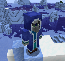
- Toms Mobs: Adds unique mobs to Minecraft that run server-side, without needing client-side mods.
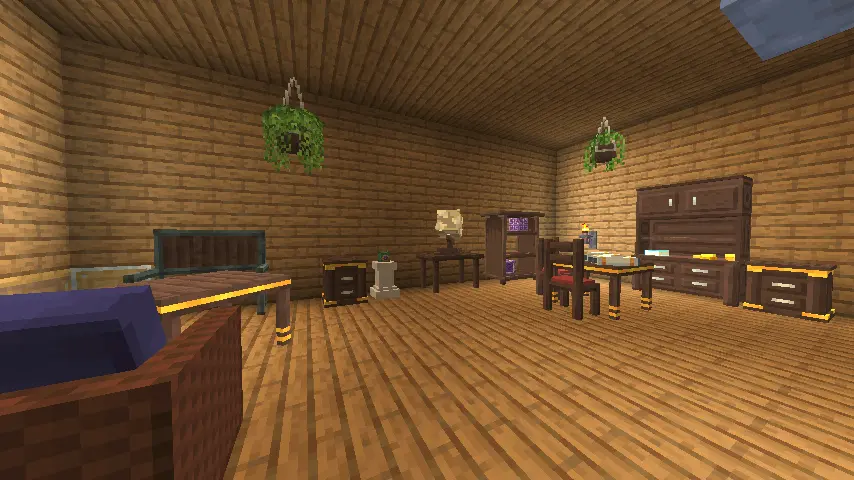
- Filament: Lets server admins add custom blocks, items, and furniture using data-packs.
- Blockbench Import Library: Makes it easy to import models and animations from Blockbench into Minecraft for server-side use.
- Camera Obscura: A serverside mod that lets players render their POV in-game as map items using raycasting.
GitHub Open-Source Projects
Explore my open-source contributions to various creative and technical projects:
Minecraft Test Server
Join the Minecraft test-server with Minecraft 1.21.4 to see my mods in action:
- mc.tomalbrc.de
Documentation
- Filament https://tomalbrc.de/docs/filament
- Blockbench import library https://tomalbrc.de/docs/bil